Case Study: Evolving Applied Intuition Into a Billion Dollar Brand
I led the initial brand development for Applied Intuition, a Silicon Valley startup that creates software tools for autonomous vehicle development. During this process, we created the company's first mission statement, a new logo, brand identity, and a unique 3D brand language.
By 2020, Applied had significantly expanded its product portfolio, revenue, and customer base, which now included major automotive companies. As a result, the company was preparing to raise a Series C funding round with an anticipated valuation of ~$1 billion.
To reflect its rapid expansion, attract top talent, and establish credibility in the global automotive industry, Applied needed a substantial update to its brand and website – all before engaging with investors.
Process & Solutions
"The Software Factory”
Over 20 bespoke 3D animations
From start to finish in 2 weeks
Outcomes
Raised $140M on a $1.25B valuation from top investors
Applied's new visual language set an industry trend followed by companies like Rivian and Samsara
The "Software Factory" metaphor informed sales narratives that helped close major OEMs from Japan and Europe
Process & Solutions
"The Software Factory”
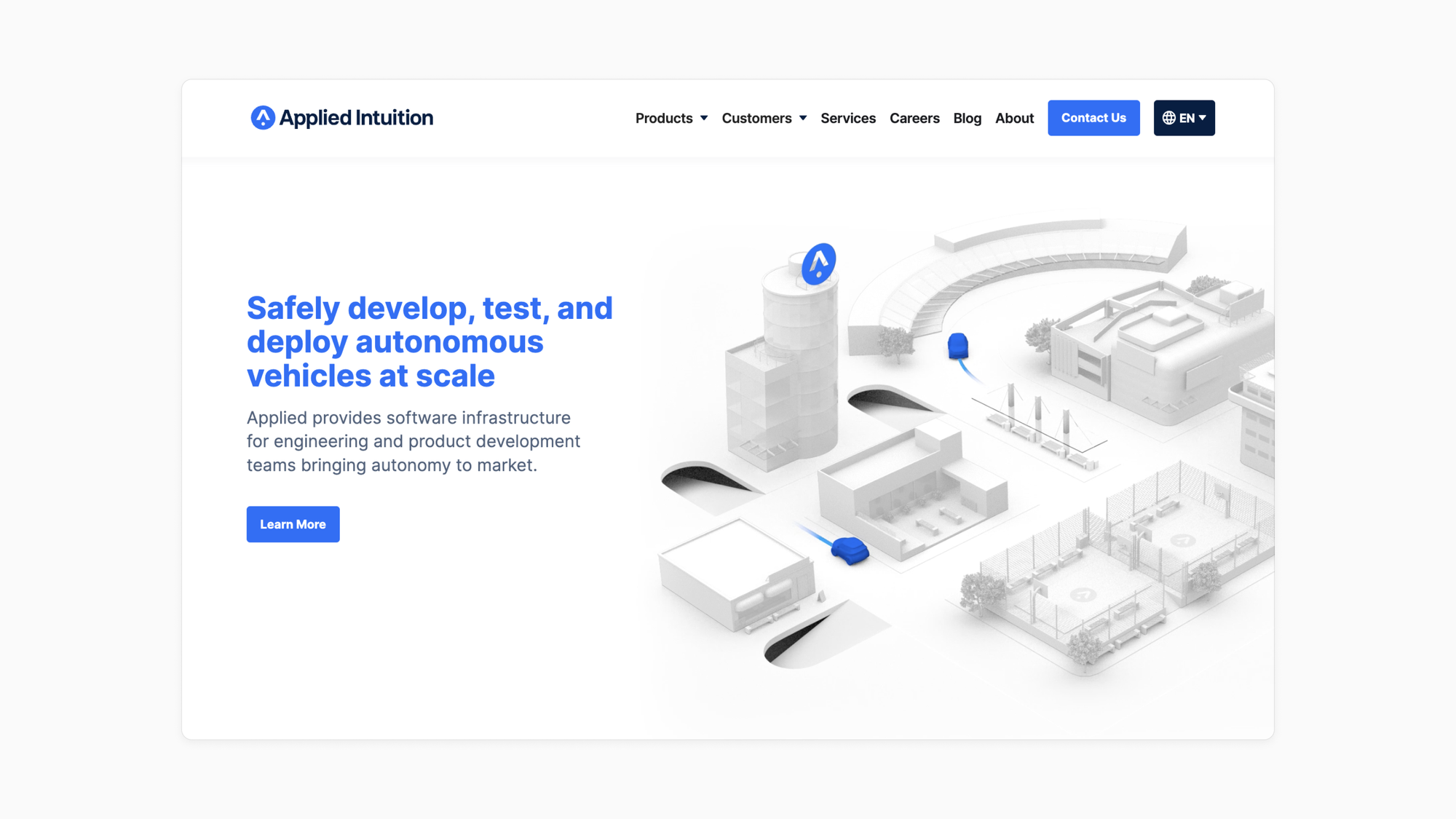
Applied's original 3D visual language (shown below) positioned the company as a leader in the autonomy industry, but it didn’t visually articulate Applied’s role in autonomy relative to its customers.
Applied's homepage in 2018
To distinguish Applied’s brand, we shifted our focus from depicting the outcome of autonomy (safe, driverless vehicles navigating open streets) to showcasing the process of autonomy: software development.
Challenge
- It's difficult to represent the complex and abstract ideas of autonomous vehicle software development (eg. drive data, perception, validation, simulation) in a simple and engaging way.
- Other companies used clichéd visuals like Matrix-style 1s and 0s or software engineers at desks, but we found these approaches both uninspiring and stuck in the uncanny valley.
Approach
- We turned to the physical manufacturing and assembly of vehicles as the core brand metaphor for Applied's new visual language.
- We specifically referenced high-end, cutting edge companies like Porsche and Tesla, who reflect Applied's commitment to premium, modern software development and customer satisfaction.
Execution
- We took the concept of real-world vehicle production lines for chassis, doors, and paint jobs and translated it into an imaginary factory for creating and assembling various elements of AV software development.
- This metaphor, called "The Software Factory," was the basis for the company's new visual language and narrative for sales/marketing materials.
Over 20 bespoke 3D animations
"The Software Factory" metaphor provided a logical framework and ample references – like assembly lines and mechanical arms – to build a robust visual language across the website and all other sales/marketing materials.
Challenge
- We drafted over 20 distinct value propositions and use cases to explain Applied's expanded product portfolio, each of which needed to be visually augmented across multiple pages on the website.
- To enforce visual simplicity, we required each animation to be a perfect loop
Approach
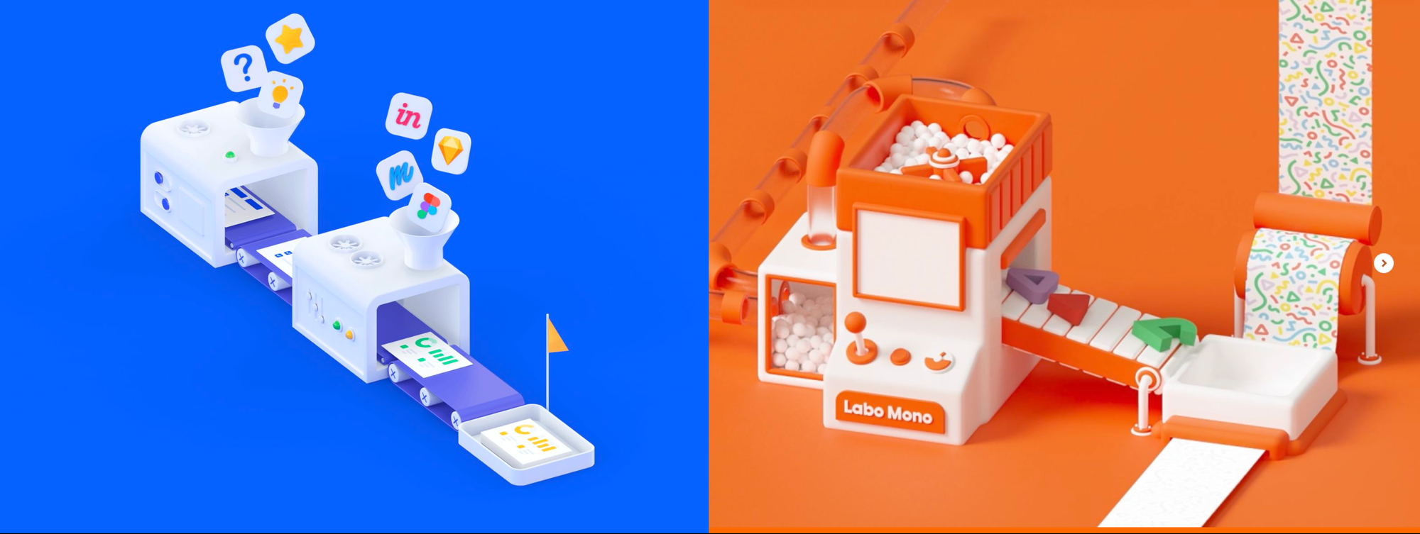
- We researched and provided visual references as art direction for the 3D execution.
- Every animation was created to augment specific website content.
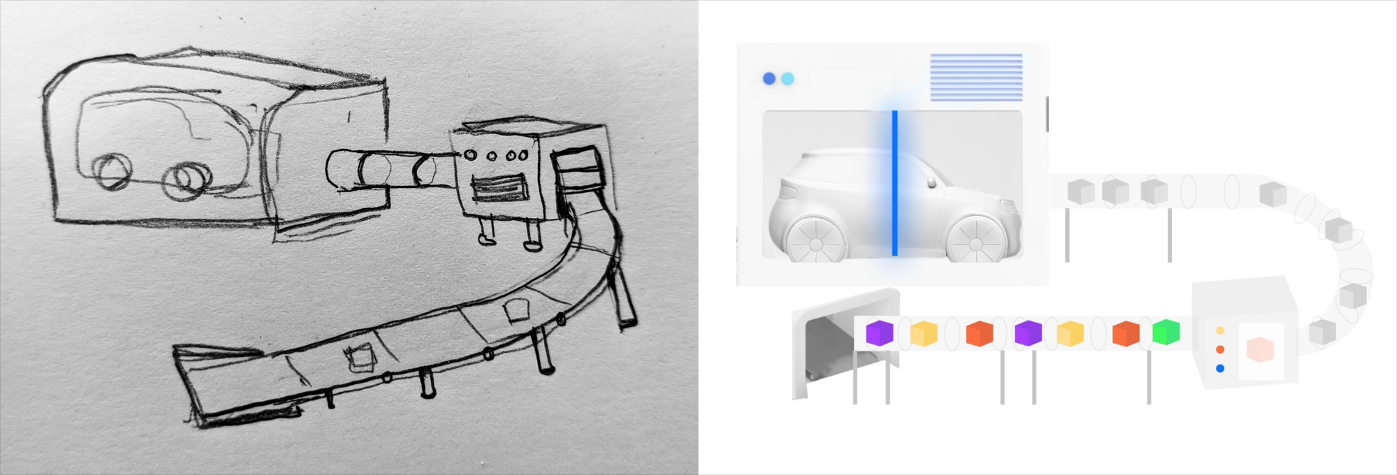
- Concepts began in pencil before moving to crude digital sketches that included a description of the animation sequence.
Execution
- To enforce simplicity we refrained from using written language or human interaction in the animations, and we never cropped or faded objects exiting the scene – every object has a visible entrance and exit.
- We created the "software factory" through imaginary machinery that mixed physical vehicle production with the digital nature of software.
From start to finish in 2 weeks
Challenge
- We had a two week implementation deadline while animations and content were still being finalized.
- Applied's products were still in stealth to the general public, which required the website content to strike a delicate balance between detail and mystery.
Approach
- We assembled a team of 5 people for an intense 2 week development sprint.
- The website architecture divided Applied's product portfolio into platform, simulation, and infrastructure.
Execution
- Every page on the website featured the same anatomy: hero header and animation, the workflow enabled by Applied's products, then use cases.
Outcomes
Raised $140M on a $1.25B valuation from top investors

Applied's new visual language set an industry trend followed by companies like Rivian and Samsara
After launching Applied's new website in October 2020, several companies began copying the signature minimal, pure white 3D visual language.
In early 2021, months after Applied's launch, Samsara updated their brand from a pink and teal color scheme without any 3D animations to a similar blue color scheme and all white animations:
Smaller brands in the logistics space also followed suit, in some cases even copying specific animation patterns:
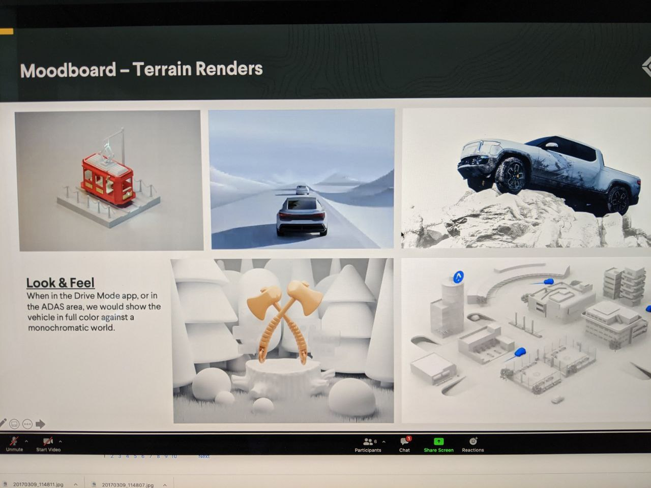
Applied's visual language was also referenced by leading automotive companies such as Rivian, as shown from this moodboard screenshot from an internal meeting shared by a former employee:
The "Software Factory" metaphor informed sales narratives that helped close major OEMs from Japan and Europe
